Week 8 - Level Blocking
This week we'll be discussing level blocking and how the Z as Y Isometric tilemap has been created.
To begin, the level design tiles were created using Aseprite. The tilemap went through many stages and has changed a little since the start. To create the tileset I used a tutorial from Adam Younis on youtube. The tutorial gave the basics for a 2d tileset with walls along the back faces. I expanded the tileset to include a few more pieces as shown below in Final Tileset.
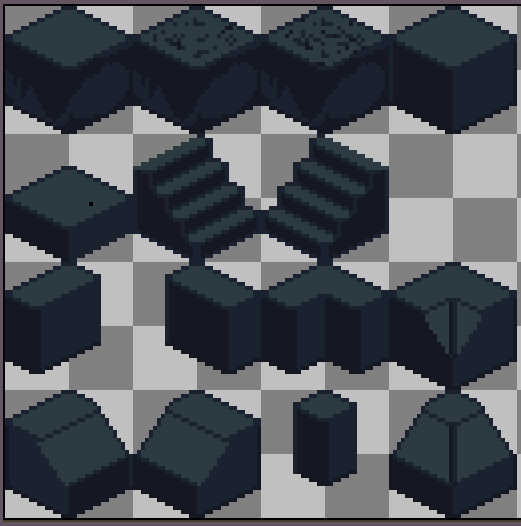
This evolved over a few weeks as different building blocks were needed to create the level, such as higher walls and building blocks for different angles As well as a visual representation for colliders. The file tileset is shown below.
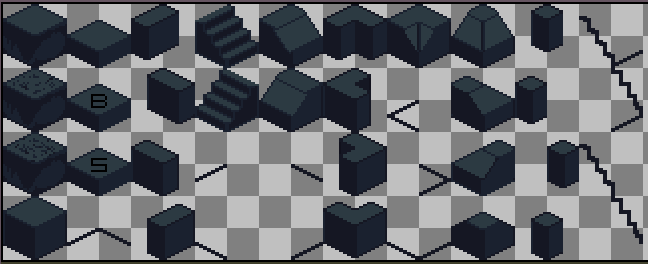
To create the first level on the Z as Y Isometric tilemap, the tileset was broken up in to 32x32 pixel blocks with each representing a building block for the level. The cell size for the grid follows the top face of the tiles, with X = 0.32 and Y = 0.16; The Z cell size is set to 2 so that tiles can be moved and locked to simulate elevation. The top left tile piece was used as the ground floor and various other tiles to define walls and edges of the level. Unity has a great blog post detailing how to define the sorting of isometric tiles and using textures for environmental effects. This blog post was used to get the sorting axis correct and define the tile size within the grid.
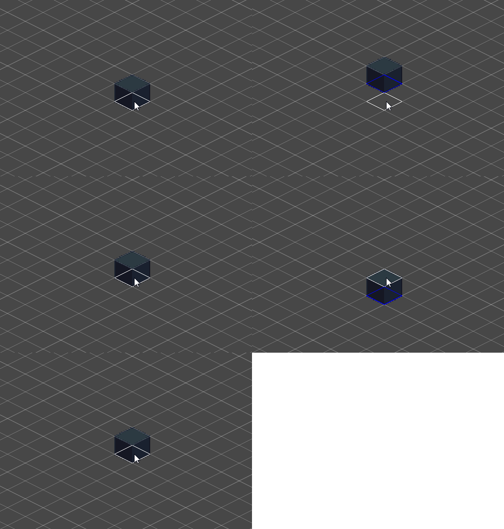
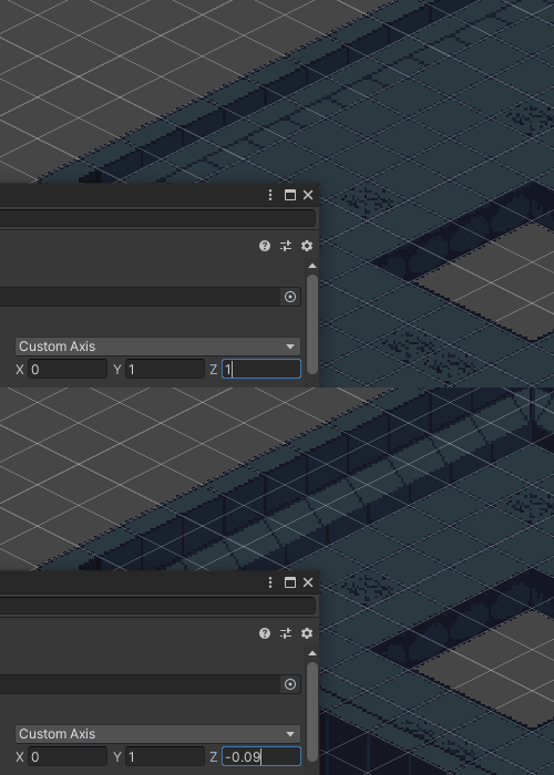
Initially there were some problems with displaying elevation as the sorting axis wasn't correct. The player would get stuck behind some tiles but not others and would be rendered behind tiles but not in front of them. To fix this problem the initial setting of Z=1 was changed to -0.09.
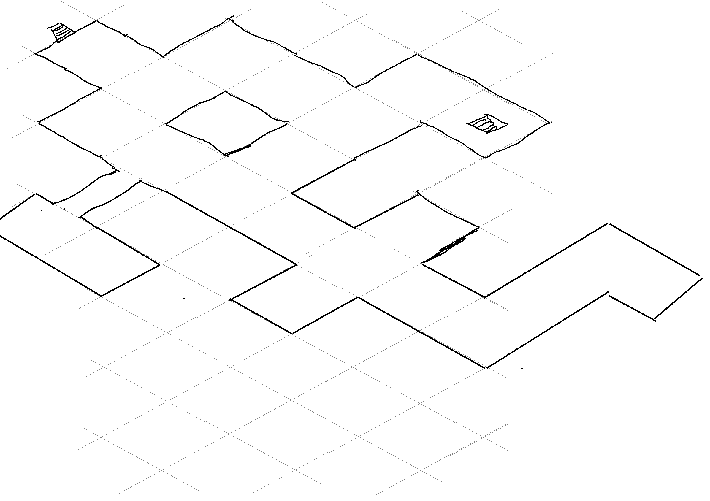
The first level was mapped out on paper roughly and then designed on paint. The design was followed to make blocked out the tiles easier. Each room is 12x12 tiles with the walls taking up 1 tile each making the rooms 10x10 tiles, this gives the player a feeling of entering a new room visually while also being able to control how the game flows. For example an enemy might lose aggression on the player if they wander too far from their spawn point.
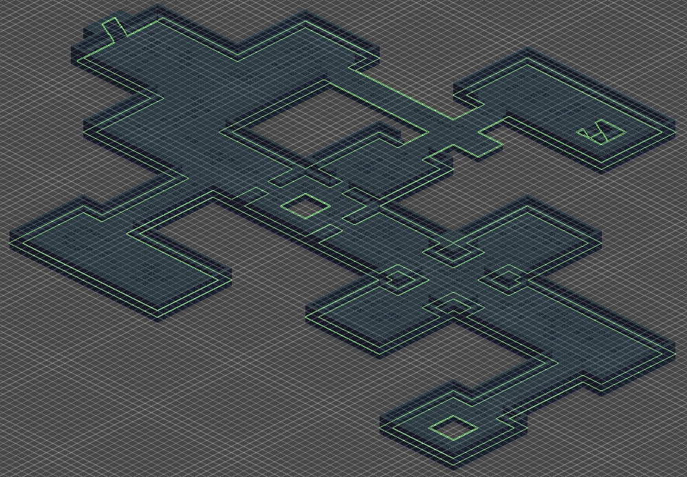
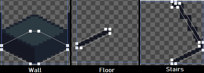
Two sets of stairs have been placed showing the possibility of more levels. The idea is that the player will descend deeper and deeper allows gameplay to revolve around finding the next level (staircase) but also exploring the level to get enough points for upgrades. The green lines represent the colliders for the map. The colliders were created by adding a separate collider tilemap so that any tile placed within the tilemap could be linked as a composite 2d collider. Each tile has a custom physics shape to use within the tilemap to create the composite collider. An example of a few tiles is shown below.
This concludes the weekly DevLog, next we explore the addition of enemies!
Thanks for reading.
Isolated
| Status | Prototype |
| Author | Spaghetti_Sauce |
| Genre | Role Playing, Action |
| Tags | Roguelike |
More posts
- Documentation + User GuideMay 30, 2021
- Week 12 - Game TestingMay 25, 2021
- Week 11 - Part 2: User InterfaceMay 23, 2021
- Week 11 - Part 1: Player and enemy movement (week 9)May 20, 2021
- Week 10 - Presentation / GraphicsMay 09, 2021
- Week 7 - Player MovementApr 25, 2021
- IsolatedApr 13, 2021
Leave a comment
Log in with itch.io to leave a comment.