Week 10 - Presentation / Graphics
Isolated » Devlog
Welcome back to another thrilling DevLog for Isolated...
This week we're talking about graphics, particularly focusing on the player and introducing some graphics for a skeleton. To start this week I was working with a placeholder graphic for the player which was just a basic human looking sprite.

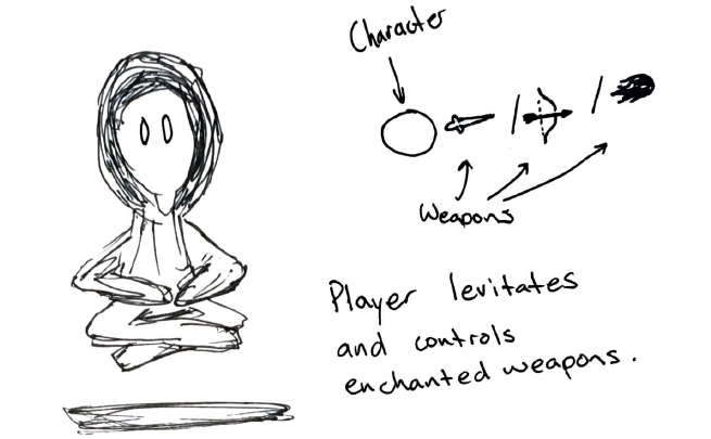
I wanted to change this sprite in to something more like the original sketched character which looks like:

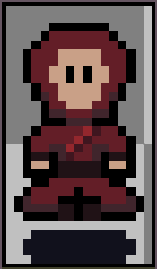
To achieve this I first designed the player with the goal of looking like the legs were crossed like the image above.
After some feedback from classmates I changed the sprite on the left to the final sprite on the right, as shown below.


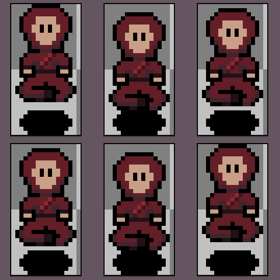
The next step in design was to create an 8-way movement for the player. This required making sprites to look in all of the moveable directions for an isometric game. This took a lot longer to do that I'd like to admit, but with the beauty of design many of these sprites could be mirrored and just be coloured in a different way to give the appearance of looking in another direction.

I now needed to start design for some enemies, a basic skeleton will do! Using the outline of the player character and adding some legs I am quite happy with how the skeleton came out.

This concludes this weeks DevLog, tune in next week for some thrilling animation and UI implementation for Isolated.
Thanks for reading!
Isolated
| Status | Prototype |
| Author | Spaghetti_Sauce |
| Genre | Role Playing, Action |
| Tags | Roguelike |
More posts
- Documentation + User GuideMay 30, 2021
- Week 12 - Game TestingMay 25, 2021
- Week 11 - Part 2: User InterfaceMay 23, 2021
- Week 11 - Part 1: Player and enemy movement (week 9)May 20, 2021
- Week 8 - Level BlockingApr 30, 2021
- Week 7 - Player MovementApr 25, 2021
- IsolatedApr 13, 2021
Leave a comment
Log in with itch.io to leave a comment.