Week 11 - Part 2: User Interface
Welcome to the rest of the Week 11 DevLog! This week a start screen and basic game UI sprites have been designed and added to the game. This DevLog will discuss how these have been implemented and how they work so far.
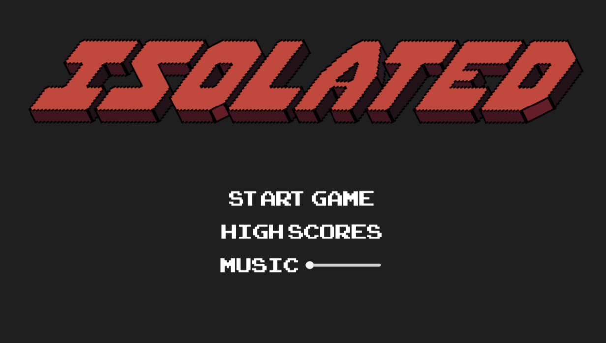
First up, the title screen. I wanted to add a basic start game button along with a highscore section and settings. Currently the only setting I can see myself working on is adding some basic music so that will be the only option. A button for the highscore has been added but is currently not working and will be developed if there is time. This will possibly just be removed if time does not permit, but for now I like it being there as it lets me strive to implement it.

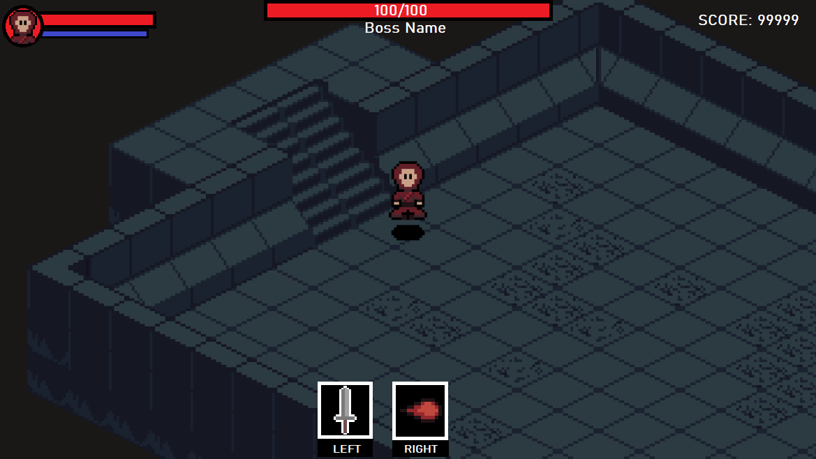
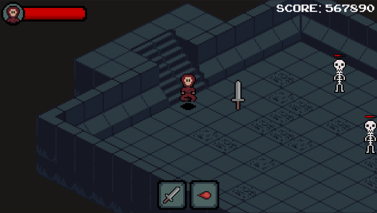
Next up is user interface or what might be better known as the HUD for the game. I wanted to add some basic things like a health bar, score counter, enemy health and lastly some icons at the bottom the remind the player of what the weapons are for left and right click. A basic layout was done in paint with placeholder graphics.

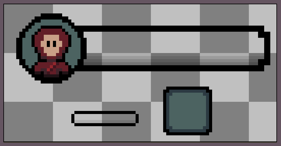
Next individual parts for the user interface were created and then added to a canvas within unity to be move around and scaled appropriately. The health bars were filled with a red scaling bar from 0-1, 0 being no health and 1 being maximum health of both the player and the enemy. These objects will need to be coded as player damage and hitboxes are implemented so that it is visible that damage is being done.

The text being used within the game is from Arcade Classic by PizzaDude on 1001fonts.com. The tutorials in class and an online tutorial'How to make a HEALTH BAR in Unity!' by Brackeys has been used to help implement these features.

Lastly the sword and fireball sprites from that are used within the game were placed as seperate game object within the canvas to show the different weapons usable by the player. If time persists with applying upgrades I would like to change the icons to replicate those weapons the player now has access to. A boss health bar would also go in the middle of the screen as shown in the initial mock-up, once again given time to implement a boss. It would also be a bit more user friendly to add a text field for the number of health the player and boss monsters have. For example, 50/100 (Current Health / Maximum Health).
Thanks, for reading this weeks DevLog!
Isolated
| Status | Prototype |
| Author | Spaghetti_Sauce |
| Genre | Role Playing, Action |
| Tags | Roguelike |
More posts
- Documentation + User GuideMay 30, 2021
- Week 12 - Game TestingMay 25, 2021
- Week 11 - Part 1: Player and enemy movement (week 9)May 20, 2021
- Week 10 - Presentation / GraphicsMay 09, 2021
- Week 8 - Level BlockingApr 30, 2021
- Week 7 - Player MovementApr 25, 2021
- IsolatedApr 13, 2021
Leave a comment
Log in with itch.io to leave a comment.